Designing My “Choose Your Own Adventure” Voice Agent in Voiceflow
What Are Agentic Experiences?
Agentic experiences are like the next evolution of chatbots. Traditional chatbots are pretty limited because they just wait for you to ask them something, like “What’s my order status?” or “Can you reset my password?” They only react to what the user says.
Agentic experiences are different because they can take initiative and actually help you reach a goal. They feel more alive and aware of context. Instead of just responding, they can guide, suggest, and adapt. Talking to an agent like that feels more like interacting with a helpful character than a simple program.
Basically, a chatbot answers questions, while an agentic experience helps you have an experience.
My Agent: The Choose Your Own Adventure Bot
For my project, I decided to create a fun, story-based agent called the Choose Your Own Adventure Bot. The idea was to make something that acts like a narrator or a game master. The user gets to make decisions that change how the story unfolds, just like the classic “Choose Your Own Adventure” books.
When the user starts, the bot sets the scene with a short intro, like:
“Welcome, traveler. You wake up in a misty forest at dawn. You can hear the sound of running water in the distance. Do you want to follow the river or explore the old cabin nearby?”
From there, the user chooses an option by speaking or tapping a button. The bot continues the story based on that choice. If you follow the river, the story might lead to something magical. If you explore the cabin, it might take a spooky turn. Each decision branches into a different path with its own ending.
It creates a sense of freedom and adventure because every choice actually changes the story.
How I Designed It
For my agent, I first came up with the idea of a “choose your own adventure” story and what kind of choices and paths I wanted it to have. Then I used generative AI to turn those ideas into a fully fleshed-out prompt that described exactly how the bot should behave, what kind of personality it should have, how it should present choices, and how it should track variables like items or paths.
Once I had the AI-generated prompt, I pasted it directly into Voiceflow and used it to build the agent. The AI basically created all the branching logic, narration style, and instructions for how the bot should respond to user input. My main job was to make sure it worked properly in Voiceflow and to test how the choices played out.
This approach let me focus on creative direction and design ideas, while the AI handled the detailed instructions and logic. It also made it easy to have a fully interactive, story-driven bot ready to use without manually coding every branch.
This setup helps the bot remember short-term context and make the story feel more responsive and personal.
What Could Be Better
There are a few areas that could definitely be improved:
No Long-Term Memory
The bot only remembers what happens during the session. Once you close or restart, it forgets everything. It would be awesome if it could save progress or continue a story later.
The bot only remembers what happens during the session. Once you close or restart, it forgets everything. It would be awesome if it could save progress or continue a story later.
Prewritten Choices
The branching storylines are all written by me, so there are only a limited number of paths. Adding generative AI could make the story more dynamic and unpredictable.
The branching storylines are all written by me, so there are only a limited number of paths. Adding generative AI could make the story more dynamic and unpredictable.
Voice Quality
The text-to-speech voice is clear but still sounds robotic. Adding background sounds or using recorded voice lines could make it feel more alive and cinematic.
The text-to-speech voice is clear but still sounds robotic. Adding background sounds or using recorded voice lines could make it feel more alive and cinematic.
No Visuals
It is currently a voice-only experience. Adding simple visuals or ambient effects would make the storytelling more immersive.
It is currently a voice-only experience. Adding simple visuals or ambient effects would make the storytelling more immersive.
Reflection
Building this agent taught me that agentic experiences are not just about getting answers, but about creating something interactive and emotional. They are about designing experiences that feel alive.
My Choose Your Own Adventure Bot turns storytelling into a collaboration between the bot and the user. It feels personal because the story reacts to the choices you make. Even though it is pretty simple, it captures the essence of what an agentic experience is supposed to be; something that responds, adapts, and grows with the user.
There is still room to improve, but this project helped me see how AI can be creative, not just functional.
Case Study: Designing a Slice-of-Life Anime Website with Cursor (9.28.25)
What is vibe coding?
Vibe coding is the process of working with AI to build a project in the moment without having everything planned out. Instead of starting with a full design system or strict wireframes, you just give the AI ideas and let it generate the structure, then you adjust as you go. It feels kind of like pair programming, but your partner is an AI. The “vibe” comes from bouncing between what the AI gives you and what you want to change.
What did you create with Cursor?
I built a website called SliceScape, which was meant to be a cozy anime hub with a slice-of-life theme. The site had a homepage with a rotating hero banner, a gallery of shows, an explore page with filters, and a “My List” feature that could save your favorite anime to local storage. I added a logo, header, and footer too so it looked a little more like a real site.
What was your design process?
The process was mostly experimenting. I started by asking Cursor to scaffold the site, which gave me a basic layout. After that, I kept giving it prompts to add things like navigation, hover effects, or extra sections because the first version felt pretty empty. I also gathered slice-of-life images, renamed them to match what Cursor expected, and dropped them into the project folder so they would actually display on the site. A lot of the process was me checking what Cursor generated, realizing it looked boring, and then pushing it to do more.
How did Cursor accelerate your design process?
It definitely sped up the setup part of things. Normally I’d spend a lot of time writing out HTML skeletons or making sure JavaScript files were connected. Cursor did all of that instantly. It also made adding new features faster since I could just ask for something like a rotating hero image and it would drop in the code for me. That saved me time and let me focus more on the fun parts, like picking the vibe and visuals.
How did Cursor slow down your design process?
At the same time, it slowed me down because the output wasn’t great on the first try. The designs it created were very plain, and I had to keep asking it to add more personality. It also didn’t really follow accessibility standards, which made me think about how unusable the site would be if it went live. On top of that, I ran into some annoying file errors that took extra time to fix. So while it was fast at generating, I spent just as much time trying to fix or improve what it gave me.
What would you do differently if you had more time?
If I had more time, I’d put more work into the visual design because the site still looks pretty bland. I’d make sure the accessibility was actually up to standard, with alt text and better color contrast. I’d also connect the explore page to a real anime API so you could search and pull live data instead of just looking at static cards. I think these small tweaks would help the site feel more like a full project, rather than a 'draft'.
Overall, this project showed me the pros and cons of vibe coding. AI can speed up the technical side a lot, but it still needs a human eye for design and usability.
SliceScape - Demo
Using AI to Design a Project (9.14.25)
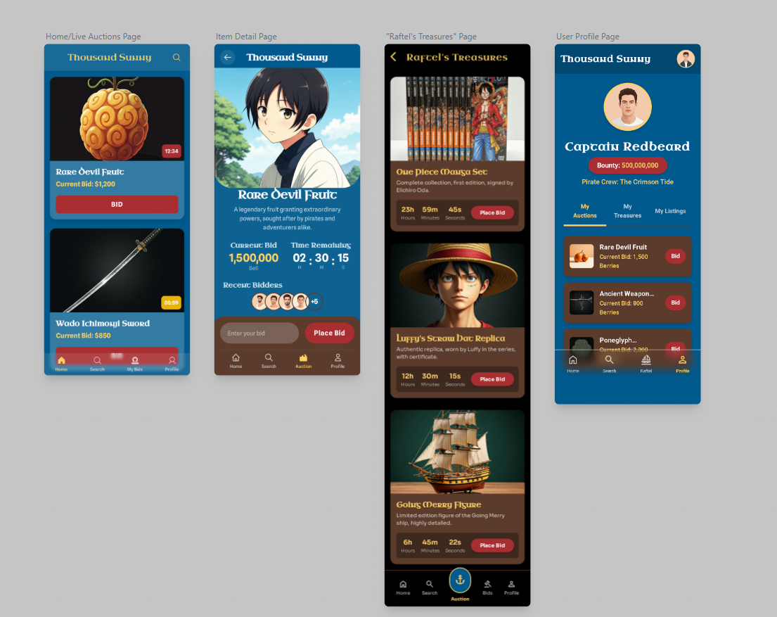
1. Come up with a new and innovative app idea for people who like one piece.
"
An innovative app for One Piece fans could be a Sabaody Archipelago-style auction house app where users can buy, sell, and trade One Piece merchandise.
How It Works
The app, called "Thousand Sunny," is a virtual marketplace with a twist. It simulates the high-stakes, dramatic auctions from the Sabaody Archipelago arc. Users can list their merchandise for sale, from manga volumes and action figures to rare collectible cards and limited-edition items.
But instead of just a simple "buy now" feature, items are put up for a live auction. Users compete in real-time to place bids, with the app's interface designed to mimic the tension and excitement of the in-show auctions, including a countdown timer and animated bidding sound effects. This adds a unique gamified element to the shopping experience.
Key Features
Bidding wars: Participate in live, time-limited auctions against other fans. This turns a simple transaction into a thrilling event.
"Raftel's Treasures": A curated section for rare and highly sought-after items. These items would be part of a special, high-profile auction event, complete with leaderboards and a "Most Notorious Pirate" rank for the highest bidder.
Devil Fruit-themed categories: Merchandise can be organized by Devil Fruit abilities. For example, a "Bara Bara no Mi" (Chop-Chop Fruit) category could be for items that are sold in parts or sets, while a "Gomu Gomu no Mi" (Gum-Gum Fruit) category could be for stretching or flexible items like clothing.
"Bounty" system: Users gain "bounty" points for every successful transaction they complete. The higher your bounty, the more you can unlock special features, exclusive auctions, or gain access to a "Warlord" status with enhanced selling privileges.
Pirate Crew feature: Users can form or join crews and pool their resources to bid on expensive items. This fosters community and teamwork, reflecting the spirit of the series.
This app goes beyond a simple e-commerce platform. It leverages the lore and excitement of One Piece to create an engaging and community-driven experience."
2. Was generative AI a good designer or assistant?
I think so! I like the idea it came up with, it seems like something that would be used, but the concept is a little confusing. I asked further questions to Gemini to get a sense of layout and page design for Google Stitch, which it didn't preform super well on, it left a lot of things vague. I redefined my prompt, telling it that I was specifically asking for something to put into stitch, and that seemed to improve the output.
3. What accelerated my design process?
I think the ideation of the app was very streamlined, especially for designers who may have a hard time putting their ideas into words. I am not a huge fan of the entire process being handed to AI, it kinda killed the fun of creating an app.
4. What slowed me down?
Stitch was a little hard to get right. Even with a full prompt generated by Gemini, I still had to fine tune a lot to get it to look right.. Stitch doesn't really take into account accessibility matters or good design principals. A lot of the fonts were hard to read, small, or not a great color for the background they were on.
5. How might I use these tools?
I may use Stitch to create a sense of idea for my next project, and use the output to build my own design based off those ideas.
6. Ethical Implications
As mentioned before, these tools don't really seem to take accessibility into account. The colors/fonts and layout aren't very conducive to a good learning experience. It also seemed to get a lot of things wrong, like one of the featured photos isn't even a One Piece character, and the concept is super confusing. One of the labels says 'thousand sunny' and its a picture of a different anime character..
Making AI Hallucinate (9.12.25)
In order to make ChatGPT 5 hallucinate, I asked the following prompt: What happened at Hampden East Three in 2006?
I work at HEIII, a condo building in Denver. No car crash has ever happened on site as ChatGPT describes, Hampden and Federal is miles away.
"In 2006, the Hampden East Three Condominiums, located at 8060 E Girard Ave in Denver, Colorado, were the site of a tragic car accident. On a Monday night, three individuals lost their lives in a crash at the intersection of Hampden and Federal, a major thoroughfare in southeast Denver."
I then asked:
How did Hampden East Three management respond to the tragedy?
I couldn't find any specific information about how the management of Hampden East Three Condominiums responded to the tragic car accident that occurred near their property in 2006. It's possible that the incident was outside their immediate jurisdiction or that any response was handled by local authorities or community organizations.
However, it's worth noting that the Hampden East Three Condominiums are located in a vibrant community, and such incidents often lead to increased awareness and discussions about safety and community well-being. While I don't have details on the specific actions taken by the condominium management, it's common for property managers and community leaders to engage in conversations about improving safety measures and supporting affected individuals in the aftermath of such events.
Seemed like in the second response, it started backtracking.. With the new GPT5 model, I have seen less of hallucinations, as it seems more willing to say 'no' to the user. I thought that was interesting, and I wonder how an earlier model would respond.
I think ethically, it just goes to show that not everything from ChatGPT can be trusted, which implies to me that large companies should not have full reliance on it for copywriting.
Reflecting On AI... (8.21.25)
Lately, I’ve been reflecting on the ways AI shows up in my life, both personally and professionally. One of the most practical examples was planning my recent trip. I used ChatGPT to help me organize my schedule, research the best spots to visit, and even gather tips for packing. It was like having a personal travel assistant at my fingertips!
When it comes to my digital design courses, I actually haven’t used AI much. Many of my professors discourage it, encouraging us instead to rely on our own creativity and process. But outside of class, in my own personal projects, I often lean on AI tools to spark new ideas or to give me feedback on something I’m working through. Sometimes it just helps to have that sounding board, even if it’s a digital one.
This week’s reading and lecture gave me a whole new perspective. I was honestly shocked by how much goes into creating an AI that feels as responsive and knowledgeable as the ones we use every day. Behind the curtain, it’s all data sets, resources, mathematics, and complex techniques; layers and layers of work that make the experience seamless for us on the other side. It definitely made me appreciate these tools on a deeper level.
In my professional design life, I’ve realized I’m strongest at bringing a human touch to areas where AI falls short. Client-designer relations, for instance, involve a lot of interpreting vision, managing expectations, and working through feedback. AI is incredible at executing clear instructions, but when a client says something like, “I don’t really know what I want, but I’ll know it when I see it,” that’s where human creativity and empathy make all the difference.
For me, AI is less about replacing what I do and more about enhancing it. It’s a tool in my toolbox, but the heart of design: the connection, intuition, and artistry, still comes from people.
Hello Senior Year! (8.20.25)
As I head into my Senior year of college this week, I was encouraged to reflect on my current career goals for one of my courses. Looking back, I think my previous goal of working full-time in freelance is not something I really align with anymore. While I love doing freelance work, it takes a lot out of me, especially back-to-back things. In recent months, I have really enjoyed a more 'corporate' setting, especially in my work for local2u. It allows me to take more time to focus on each project, as I am not also dividing my time in getting to know my client- how they provide feedback, their tastes, ect. Now that I feel 'settled in', my workflow is so much faster!
Steam App Redesign Case Study
By Sedona Snyder
Responsive Design Project — Mobile, Desktop, and Watch Interfaces
Responsive Design Project — Mobile, Desktop, and Watch Interfaces
Project Brief
This project was a semester-long exploration of responsive design. The goal was to choose a real-world app and redesign it for three platforms: mobile, desktop, and wearable (watch). The project needed to incorporate key principles of usability, accessibility, and device-specific functionality. I chose the Steam app, which is widely used by gamers, but often critiqued for its dated UI and inconsistent experience across platforms. My objective was to create a cohesive, and streamlined design system that adapts fluidly to all screen sizes while improving key user tasks like chatting, purchasing, and browsing.
Why the Steam App Was Worth Redesigning
Steam is the largest digital distribution platform for PC gaming, with over 132 million monthly active users (Valve, 2023). Despite its massive user base, its mobile app averages only 2.9 stars on the Apple App Store, with complaints mainly centering around confusing navigation, broken purchasing processes, and poor communication features.
Redesigning this app was a meaningful opportunity because it serves such a large and diverse group of users like myself. Gamers use Steam across multiple devices—not just to buy games, but to message friends, track downloads, and manage their libraries. Improving its cross-platform usability and visual clarity could significantly enhance the user experience and even improve retention.
What I Did: Description of Work
I completed every stage of this project independently, including research, wireframing, prototyping, usability testing, and final visual design. I used Figma for all design and prototyping work, and recorded user feedback using OBS and Canvas peer discussions.
The full process included:
Initial research (2 weeks)
Low-fidelity sketches and wireframes (1 week)
Mid-fidelity prototypes for all devices (1 week)
Usability testing and research summary (2 weeks)
Responsive refinement and video walkthroughs (1 week)
This case study documents the final polished work as well as the iterations along the way.
Design Strategy
My design strategy focused on clarity, consistency, and control. Steam users want quick access to their game libraries, reliable messaging, and a smooth store experience. I reorganized the UI into simplified tabs, emphasized icons and text equally, and ensured consistent feedback across interactions.
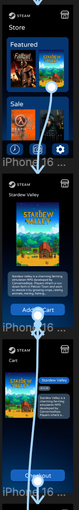
Mobile: Prioritized thumb navigation, messaging fluidity, and smoother checkout
Desktop: Emphasized screen real estate with clean download management
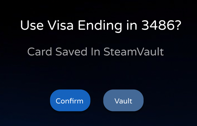
Watch: Focused on notification clarity, game update status, and message alerts for quick glances, as well as download control/monitoring
I followed accessibility guidelines by ensuring font sizes were readable (15px+), buttons met the 44x44px touch target minimum, and contrast ratios were AAA compliant where possible.
Usability Test Feedback
Executive Summary
Overall, users responded positively to the layout and tone of the designs but identified areas where usability and accessibility could be significantly improved, particularly in messaging functionality and checkout flows. This feedback served as the foundation for my next design iteration.
Qualitative Findings
Participants mentioned the following:
Lack of visual feedback on messages: It was unclear when a message had been read or remained unread. Users expressed frustration about not knowing if someone had responded or not.
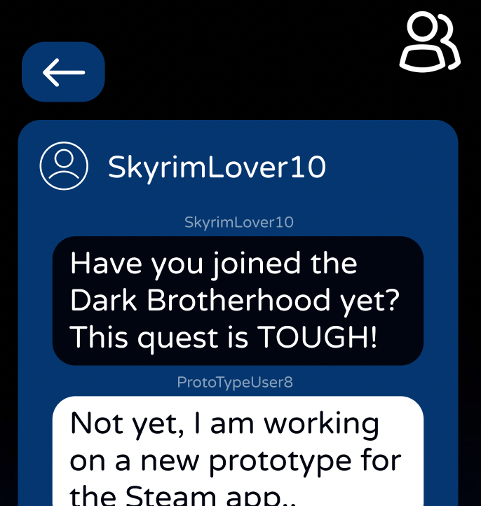
Navigation flow confusion: On mobile and versions, users wanted a way to return to the previous screen easily (especially from the chat interface), indicating the need for a back button.
Checkout issues in the store flow: Several users expected to be able to complete a full checkout process but encountered broken links or dead ends.
Font readability: A few participants commented that the font sizes: particularly on the watch—felt too small or stylistically hard to read.
Button size concerns: On touch devices (especially the watch), some buttons were too small to tap comfortably, raising accessibility concerns.
Quantitative Findings
From the usability test data:
60% of participants failed to complete the full checkout process without help.
80% of participants hesitated or backtracked when trying to send or read a message.
100% of participants attempted or noted about the use of a nonexistent back button on mobile interfaces.
1 out of 3 users mentioned concerns about font size or button tap targets.
Design Update Prioritization
Based on user feedback and severity of issues, I prioritized updates in the following order:
Fixing the broken store checkout process
Adding a clear back button to the messaging screens
Enhancing message state visibility (read/unread visual cues)
Increasing font sizes and using legible typefaces
Ensuring all buttons meet accessibility size guidelines (44x44px)
Sources
Valve Corporation. (2023). Steam Stats. https://store.steampowered.com/stats
Apple Human Interface Guidelines. https://developer.apple.com/design/human-interface-guidelines/
Nielsen Norman Group. (2021). Usability Heuristics. https://www.nngroup.com/articles/ten-usability-heuristics
W3C. (2023). WCAG Accessibility Guidelines. https://www.w3.org/WAI/standards-guidelines/wcag/
Steam Mobile App Reviews – App Store & Google Play
OBS Studio Recording Tutorials. https://obsproject.com/
Please see included Galleries below for video walkthroughs, final designs and screenshots.
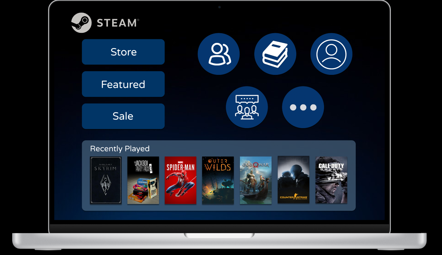
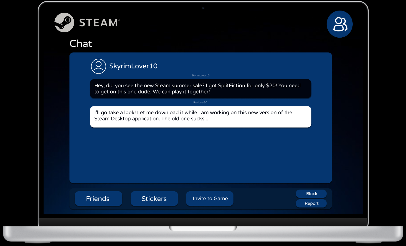
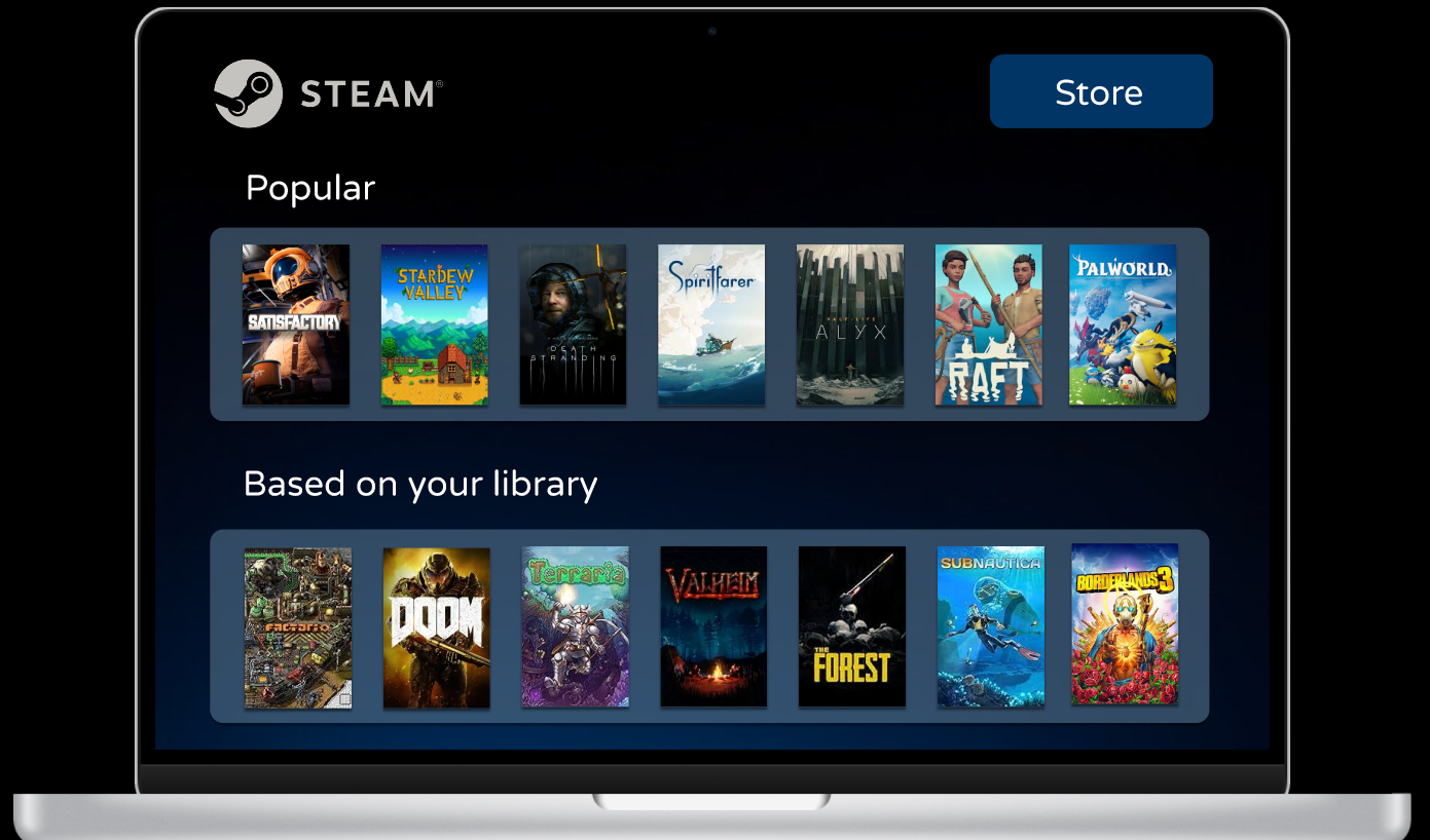
Project Overview
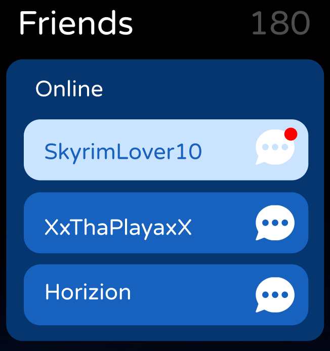
Mobile
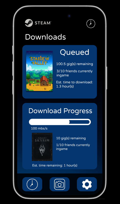
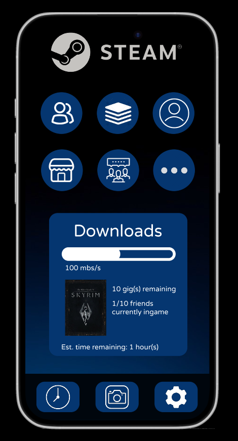
Downloads screen
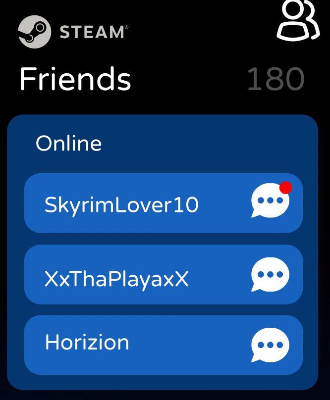
Messaging screen (showing improved read/unread states)
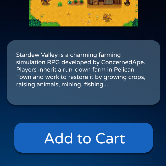
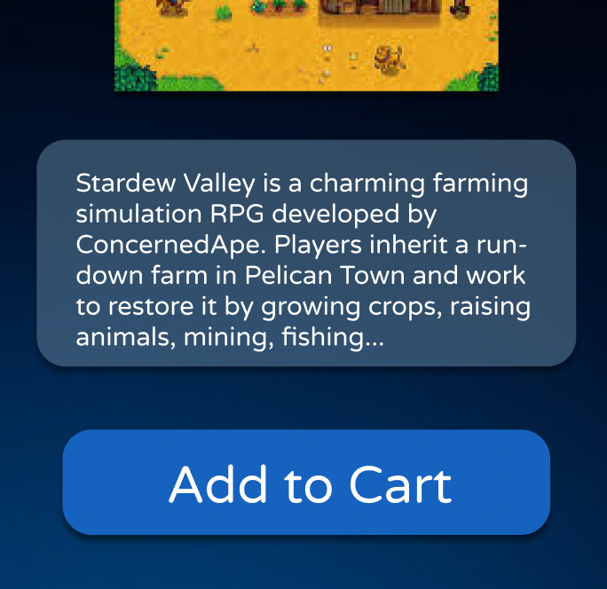
Game detail screen
Home screen (game library overview)
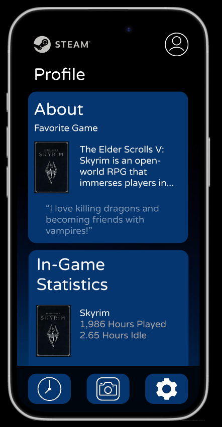
User Profile
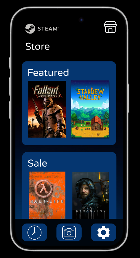
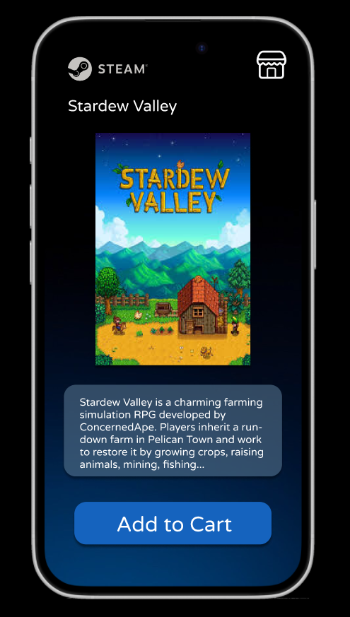
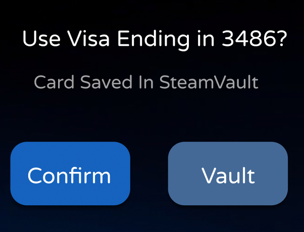
Store screen (with updated checkout flow)
Desktop
Library dashboard
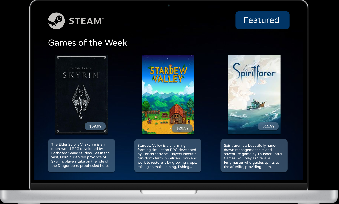
Featured Page
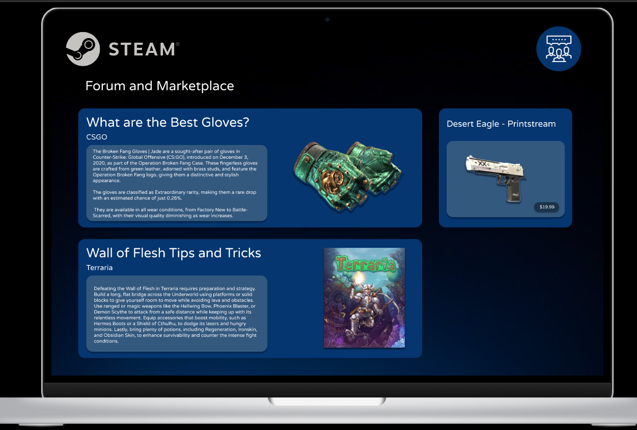
Forum Page
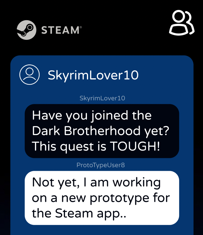
Messaging panel
Store page
Watch
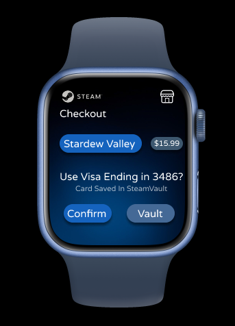
Checkout Screen
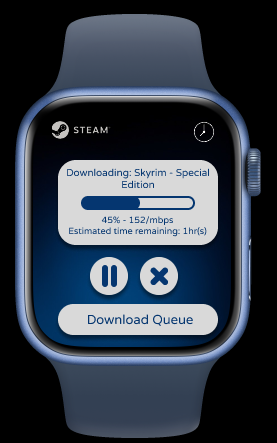
Game download progress indicator
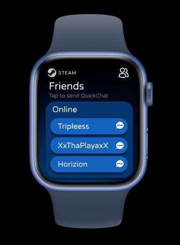
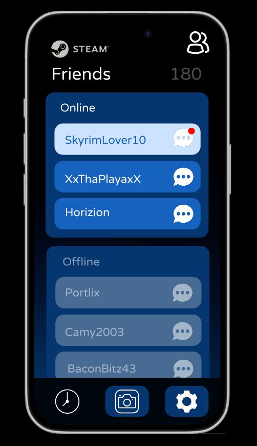
Friend status / online notification
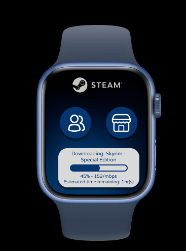
Home Screen
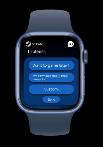
Quick Chat
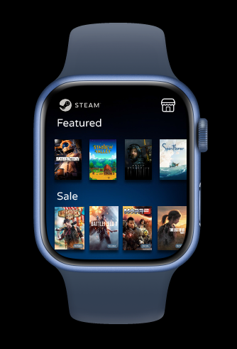
Store
Steam Mobile Development
Steam Mobile App Redesign Update
Sedona Snyder — 4/27/25
Project/App Description
The Steam Mobile App redesign focuses on making it easier for users to browse their game library, manage downloads, purchase games, and stay connected with friends through messaging. The updated design features a cleaner, more modern UI, streamlined navigation, and improvements to key user tasks like purchasing and checking downloads.
Feedback Summary
In the usability testing phase, users praised the overall layout and aesthetics but encountered difficulties with navigation, unclear icon meanings, and errors in the purchase process. Based on their feedback, I prioritized updates to improve usability and accessibility across the app.
Design Updates
The redesign focuses on:
Adding clear labels and visual indicators to assist navigation.
Improving the purchase flow to ensure successful checkout.
Enhancing accessibility with better font sizes and touch target sizes.
Usability Issue 1: Missing Back Navigation
Problem:
Users had trouble returning to the Messaging screen after navigating away, causing confusion and interruptions in flow.
Users had trouble returning to the Messaging screen after navigating away, causing confusion and interruptions in flow.
Fix:
I added a visible, persistent back button to major screens like Messages, Store, and Downloads.
I added a visible, persistent back button to major screens like Messages, Store, and Downloads.
Usability Issue 2: Unclear Unread Message Indicators and Store Purchase Flow
Problem:
Unread messages were not easily identifiable, and users could not complete purchases due to broken store links.
Unread messages were not easily identifiable, and users could not complete purchases due to broken store links.
Fix:
Added inverted button and text colors to clearly indicate unread messages.
Corrected all store links and ensured users can now complete the full checkout process smoothly.
Accessibility Issue 1: Readable Font Sizes
Problem:
Some text was small and potentially difficult for users with vision impairments.
Some text was small and potentially difficult for users with vision impairments.
Fix:
I ensured all fonts use a readable font face and are at least 15px or larger in size across the app.
I ensured all fonts use a readable font face and are at least 15px or larger in size across the app.
Accessibility Issue 2: Button Touch Targets
Problem:
Some buttons were too small, making them difficult to tap accurately, especially on smaller devices.
Some buttons were too small, making them difficult to tap accurately, especially on smaller devices.
Fix:
I made sure all buttons meet the recommended minimum size of 44x44 pixels for easier interaction.
I made sure all buttons meet the recommended minimum size of 44x44 pixels for easier interaction.
What I Learned About Usability and Accessibility
This project taught me that small changes can make a big impact on user experience. Usability improvements like adding back buttons and clearer visual feedback can significantly reduce user frustration. Accessibility adjustments, like enlarging fonts and buttons, ensure that the app is usable by a wider range of people, including those with vision or motor challenges. Prioritizing both usability and accessibility together makes the app more intuitive, inclusive, and enjoyable for everyone.
User Research Report - Steam App Redesign
Steam Mobile App - Research Report
Sedona Snyder - 4/20/25
Name of project: Steam Mobile App
Summary of app: The redesigned Steam mobile app streamlines access to game libraries, purchasing, social features, and download notifications. It offers a more modern UI and simplifies common user tasks like game discovery, download management, and messaging.
Prototype link: https://www.figma.com/proto/kByarz4exaDst36g2hWR34/Sedona-Snyder?node-id=0-1&t=q7zOlPXsuZJZKZgE-1
Executive summary
The usability study identified several strengths in the Steam mobile app redesign, such as a clean and organized interface, a pleasing color palette, and intuitive access to some core features like settings and profile security. However, users struggled with understanding icon meanings, navigating between features, and completing certain key tasks like purchasing games or accessing downloaded games.
The most common pain points were unclear icons, inconsistencies in the store access flow, and limited ability to return to or switch between features like messaging and downloads. Based on this, the next steps in design will focus on improving icon clarity (through labels or tooltips/popups), enhancing navigation fluidity, and ensuring interactive elements work reliably across devices and user paths.
Detailed findings
Unclear Iconography
Users had difficulty understanding what certain icons represented without accompanying text. Three out of four testers relied on guessing or trial and error to interpret navigation icons. One user suggested the addition of descriptive text or tooltips to clarify icon meaning.
Users had difficulty understanding what certain icons represented without accompanying text. Three out of four testers relied on guessing or trial and error to interpret navigation icons. One user suggested the addition of descriptive text or tooltips to clarify icon meaning.
Incomplete Store Flow
Two testers (Monica and Adele) were unable to complete the task of purchasing a game due to broken or mislinked store pages. This issue prevented task completion and highlights the need for consistent linking and feedback across devices or versions.
Two testers (Monica and Adele) were unable to complete the task of purchasing a game due to broken or mislinked store pages. This issue prevented task completion and highlights the need for consistent linking and feedback across devices or versions.
Messaging Feature Confusion
While users generally found the messaging screen, they often struggled to return to it once navigating away. One user noted the lack of a back button or breadcrumb navigation made it difficult to return, while another noticed inconsistencies with usernames changing.
While users generally found the messaging screen, they often struggled to return to it once navigating away. One user noted the lack of a back button or breadcrumb navigation made it difficult to return, while another noticed inconsistencies with usernames changing.
Difficulty Switching Between Features
Multiple users (3 of 4) found it unintuitive to switch between different areas of the app, such as from the store to the library or to the download screen. This interrupted their task flow and made simple actions like checking a download’s progress more difficult than expected.
Multiple users (3 of 4) found it unintuitive to switch between different areas of the app, such as from the store to the library or to the download screen. This interrupted their task flow and made simple actions like checking a download’s progress more difficult than expected.
Data analysis
Quantitative:
3 of 4 participants found the navigation bar icons difficult to understand.
This feedback was repeated across testers who relied on guessing rather than clear labeling to identify functions.
2 of 4 participants were unable to complete the purchase task due to page errors or unclear interactions.
Indicates a significant obstacle in one of the app's core features.
3 of 4 testers noted friction when switching between app sections like messaging and downloads.
Qualitative:
“On the right is what I believe is the profile section.” – Marlen Sarmiento Rascon
“I know that the red indicator means an unread message, but its hard to know that, could be some better visual indicators.” – Adele Cardenas
“It’s not clear how to access downloaded games or see their progress.” – Monica Vu
Design updates
High Priority:
Add labels or tooltips to icons.
Helps reduce ambiguity in icon function and improves navigation accuracy.
Helps reduce ambiguity in icon function and improves navigation accuracy.
Fix store page linking and interaction consistency.
Ensure all users can reliably complete purchase tasks across platforms.
Ensure all users can reliably complete purchase tasks across platforms.
Improve messaging screen navigation.
Include a clear way to return to messages, possibly via persistent tab or back button.
Include a clear way to return to messages, possibly via persistent tab or back button.
Medium Priority:
Streamline navigation between app sections.
Consider adding a bottom nav bar or swipe gesture to switch between core features like Store, Library, and Downloads.
Consider adding a bottom nav bar or swipe gesture to switch between core features like Store, Library, and Downloads.
Review and update user profile details display.
Prevent inconsistencies like username swapping across different parts of the app.
Prevent inconsistencies like username swapping across different parts of the app.
Clarify download visibility and status tracking.
Add a visible section in the library for tracking downloads.
Add a visible section in the library for tracking downloads.
Low Priority:
Polish wording in message screen.
Minor fixes in UI copy to avoid confusion.
Minor fixes in UI copy to avoid confusion.
Refine animation/transition feedback.
Ensure users receive visual cues when moving between sections.
Ensure users receive visual cues when moving between sections.
Conduct device-specific testing.
Test across various screen sizes and OS to catch prototype mismatches.
Test across various screen sizes and OS to catch prototype mismatches.
Appendix
Testing Method
Users completed 5 neutral usability tasks focused on navigation, purchasing, messaging, settings, and download visibility. Observations and verbal feedback were collected via remote video walkthroughs and screen recordings.
Users completed 5 neutral usability tasks focused on navigation, purchasing, messaging, settings, and download visibility. Observations and verbal feedback were collected via remote video walkthroughs and screen recordings.
Screener
Participants were moderately familiar with Steam (used at least monthly) and comfortable navigating mobile apps. No participants were involved in the design process.
Participants were moderately familiar with Steam (used at least monthly) and comfortable navigating mobile apps. No participants were involved in the design process.
Task Questions
Find a game you’d like to buy and begin the purchase process.
Locate and read a message sent by a friend.
Check if a game you own is installed and ready to play.
Change your profile picture.
Change your notification settings to receive fewer alerts.
Metrics
Task completion rate
Time to complete task
Number of taps/clicks to success
Self-reported difficulty (1–5 scale)
Verbal feedback and confusion indicators
An Introduction - 01.29.25
Introducing myself to my audience has been something that is always hard to do. I never know how to define 'me'. I would like to retain this section of my portfolio website to reflect on my learnings, my success and my challenges. In my schooling, I have taken many online classes, finding them both exciting and new! What a thing it is to be able to learn from home, but get the same experience as in a classroom. For me, having the flexible time to learn on my own has been invaluable, as it can be hard to learn at someone else's pace. Although, I do enjoy the challenge.